 Esplanade and Sacred (10:00), Black Rock City, Nevada August 25 to September 1, 2003 2002 - 2003 - 2004 |
||
|
Orientation Identity Urban Plan Video Dancefloor Light Bar MylaRV Canopy Container Infrastructuralissimo Bicycles Treasure Documentation Trash Bulletin board Topica Calendar 2002 slide show Contribute financially |
Urban plan: Proposals 1. Proposal 01 by Super Ducky  2. The Offering by The Eye
Learning from our experience of the 2002 hourglass design. Simplification and tightening of last year's urban plan: the two circles merge and the ring that defines the remaining circle is thickened. It is now made of better organized host-camps including VRock lounge, Ishkabibble temple, Super Ducky bar, massage parlor, black light crypt, beauty salon, etc. The Offering has curved orange walls that attract people walking on the Esplanade into the camp. 3. The Church of Disorient [Church] [Basilica] by The Eye The Church of Disorient addresses the theme of Burning Man 2003. The organization of the camp is based on the plan of a sacred space. Sacred sites such as St Peter's church (Barton-upon-Humber) were often built in stages which makes this option particularly suited to the idea of building the camp in several stages, as participants and equipment arrive. References: Medieval Art, Bernini  4. Dandelion by Disorient
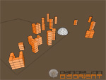
Disseminate, inspire, share. The wall-metaphor of monolithic belief-explodes into a multitude of towers and transforms the entire camp, now granular and beyond belief, into a giant art installation. Located at one extremity of the esplanade, Dandelion fuzzies-up the map of Black Rock City and further blurs the threshold between art and habitat. Individuals or groups appropriate towers and work on the inside decor, atmosphere and animation. Every tower has one or two sides facing the Man. Those sides are covered with orange mesh and flooded with sequenced lights. Sides of towers can also be covered with stretched white fabric and become video screens. Dandelion v0.1 uses 8 times the amount of scaffolding that the 2002 camp used. Screen backgrounds: [1280x1024] [1280x1024 dark] [1920x1080]  Dandelion v0.2 uses a reasonable amount of scaffolding (same as last year) while remaining true to the idea of exploded wall. This design works for any location on the Esplanade (corner or regular) and includes the Chamber of Her Brightest Secrets, a new pendant to the Dome. Seen from the Man the deconstructed wall resolves into a coherent whole (an orange bar of 10 feet high by 200 feet long) while the Chamber and the Dome are centered on the wall. On the floor plan the different sections of the wall are reminiscent of musical notations. Maybe this could be used as a basis for the hymn of Disorient. This porous wall design is very flexible. It allows for space compression and expansion fine-tuning by sliding the different pieces of the wall up and down on the floor plan, perhaps to create a more compressed exterior dancefloor close to the Dome for instance.
5. Vertical Wall by The Eye 6. Milky Way by Randy Remote Firmament and the fence get busy and produce their child: The spiraling, orange mesh strobey mess. Each double stacked section would have a strobe corresponding to the controller of firmament, potentially allowing a campsized pattern (best appreciated from above). This layout draws people in, and the stroboscopic maze prevents them from finding their way out. Milky Way is also an experiment of hidden sound. The dancefloor system is framed with sections, dancers aware that sound is coming from some of these monsters, yet unable to visually pinpoint their exact source, as sound is omnipresent (4 stack system). Casual travelers around the dome experience something similar (dome system moved outside hte confines, subs stay in dome. The DJ has full view of dancefloor via the enviromentally sealed rental truck or cockpit, yet the dancers cannot spot him out as more strobes and mesh prevent full identification. Ample space around the stage provides parking for bicycles. |
Participate - Share your vision: submit a proposal for the urban plan of the Disorient camp at Burning Man 2003. - Make comments and suggestions and read what Disorienters have to say about the proposals on the Disorient's bulletin board. |
|
[ Comment ] [ Burning Man ] [ Disorient ] Maintained by The Eye for Reorient, 2003 
|